mirror of
https://github.com/photoprism/photoprism.git
synced 2026-03-02 22:57:18 -05:00
Dashboard: Punch card view similar to GitHub #175
Labels
No labels
ai
android
api
auth
awesome
bug
bug
ci
cli
config
database
declined
deprecated
docker
docs 📚
documents
duplicate
easy
enhancement
enhancement
enhancement
epic
faces
feedback wanted
frontend
hacktoberfest
help wanted
idea
in-progress
incomplete
index
invalid
ios
labels
live
live
low-priority
macos
member-feature
metadata
mobile
nas
needs-analysis
no-coding-required
no-coding-required
observability
performance
places
please-test
plus-feature
priority
pro-feature
question
raspberry-pi
raw
released
released
released
research
resolved
security
sharing
tested
tests
third-party-issue
thumbnails
upgrade
upstream-issue
ux
vector
video
waiting
won't fix
won't fix
No milestone
No project
No assignees
1 participant
Notifications
Due date
No due date set.
Dependencies
No dependencies set.
Reference
starred/photoprism#175
Loading…
Add table
Add a link
Reference in a new issue
No description provided.
Delete branch "%!s()"
Deleting a branch is permanent. Although the deleted branch may continue to exist for a short time before it actually gets removed, it CANNOT be undone in most cases. Continue?
Originally created by @lastzero on GitHub (Jan 22, 2020).
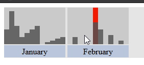
As a user, I want to see my activity so that I can jump to interesting points in time and know when I'm taking lots of photos.
Like and/or comment this, if you would like to have such a view in PhotoPrism. See also #152 and #154. Punch card on GitHub:
@guysoft commented on GitHub (Jan 26, 2020):
There is a similar feature on ownphotos where there is a graph with bars.
@lastzero commented on GitHub (Jan 26, 2020):
Everyone is invited to post screenshots of implementations you like or find useful :)
@RAYs3T commented on GitHub (Aug 5, 2020):
Examples from other sites / apps
GitLab's implementation is much similar to GitHub's, but still looks great.
Another approach would be a design like Darktable has it
This one would most likley fit better into the site.
@guysoft commented on GitHub (Aug 5, 2020):
Another example would be on ownphotos:
@RAYs3T commented on GitHub (Aug 5, 2020):
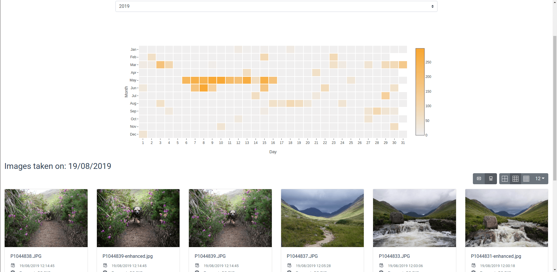
I've quickly created a mock in only html/css. Should i make this a thing and write some code for the bucketing / generation?
Hover (gif): https://nc.edging.tech/s/69ZFCariiNebS5P
@sebastian-raubach commented on GitHub (Nov 27, 2020):
This is what Frickl does:
@lastzero commented on GitHub (Nov 27, 2020):
They've stolen our idea 😬
@jkgeyti commented on GitHub (Mar 3, 2021):
https://github.com/photoprism/photoprism/issues/1113 got closed in favour of this ticket, but since they describe slightly different proposals (punch cards vs date histograms), I wanted to weigh in favour of histograms. Punch cards are really useful for things like commits, where you want to see recurring (weekly) patterns, but imo, they don't lend themselves well to range selections (do you highlight a square, click multiple boxes, or what?).
Range selectors over histograms (like in the gif below) make for (imo) more intuitive date filtering. Highlight a horizontal area to "zoom in" on a specific date range, and double click (this isn't super intuitive I'll admit) the histogram to "zoom out".
A histogram will show bins based on the resolution - maybe it's only showing weeks or months when "zoomed out" to span your entire collection, but you can repeatedly "zoom in" on a sub-selection, and each time the bins will update to show shorter ranges (months, weeks, days, hours as you select a smaller and smaller sub-section. This allows users to very precisely pinpoint events in time, by repeatedly selecting a smaller and smaller date range on the histogram. The date rnager histogram in Kibana (https://demo.elastic.co/app/discover) shows an example of this behaviour.