mirror of
https://github.com/rustdesk/rustdesk.git
synced 2026-03-02 19:26:56 -05:00
[Bug] Incorrectly inverted elements in dark theme #1391
Labels
No labels
bug
documentation
duplicate
enhancement
enhancement
enhancement
good first issue
help wanted
invalid
question
unreproducible
wontfix
No milestone
No project
No assignees
1 participant
Notifications
Due date
No due date set.
Dependencies
No dependencies set.
Reference
starred/rustdesk-rustdesk#1391
Loading…
Add table
Add a link
Reference in a new issue
No description provided.
Delete branch "%!s()"
Deleting a branch is permanent. Although the deleted branch may continue to exist for a short time before it actually gets removed, it CANNOT be undone in most cases. Continue?
Originally created by @rakleed on GitHub (Feb 17, 2023).
Is there an existing issue for this?
Bug Description
How to Reproduce
Expected Behavior
Elements are correctly inverted in the dark theme and have sufficient contrast against the background.
Operating system(s) on local side and remote side
Windows 11 -> macOS Ventura
RustDesk Version(s) on local side and remote side
1.2.0 nightly
Screenshots
Screenshot gallery
Additional Context
No response
@rustdesk commented on GitHub (Feb 17, 2023):
Agree
@rustdesk commented on GitHub (Feb 17, 2023):
for 1: https://github.com/rustdesk/rustdesk/blob/master/flutter/lib/desktop/widgets/tabbar_widget.dart#L1109
@rustdesk commented on GitHub (Feb 17, 2023):
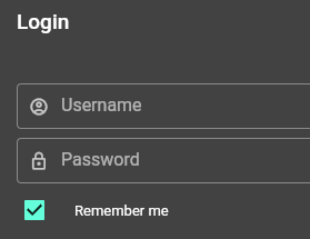
remember me checkbox is incorrect either.
@rustdesk commented on GitHub (Feb 17, 2023):
@grummbeer
@rakleed commented on GitHub (Feb 17, 2023):
It's actually all checked checkboxes in dark theme.
@rustdesk commented on GitHub (Feb 17, 2023):
@grummbeer fixed it yesterday.
@grummbeer commented on GitHub (Feb 18, 2023):
@rakleed please download a fresh nightly.
I totally agree. There are some more situations which are not covered by the theming. This topic is needing some attention.
i noticed this already
thanks, i will have a look.
so bad, your right … but not all
Its a bug, will fix that with unifiying checkboxes and space between input and label.
Agree, hate this from the first moment i saw it. There are some downsides:
@rustdesk if you agree on this, i can make a PR to remove this boxed layout for nested level options.
I already did that a few days ago, because of the UI unification, but was unsure … at many points for me it is not that easy to recognize what is intended and what not form surfing through the codebase.
Also agree, but i can not fix this at the moment due the lack of knowledge how :-(
@rustdesk commented on GitHub (Feb 18, 2023):
I believe it is not intended, @21pages could you confirm?
@21pages commented on GitHub (Feb 18, 2023):
Intended, but you can change it to look better
@grummbeer commented on GitHub (Feb 18, 2023):
@21pages Can you explain what the design goal is for that totally different style?
@21pages commented on GitHub (Feb 18, 2023):
distinguish between main/sub.
@grummbeer commented on GitHub (Feb 18, 2023):
True.
What do you think of the "permanent password" situation. This is also a second level option, but has not this boxed style.
I think the reason is that the boxed style does not fit for it, what results in a inconsist visually speech. In my opinion the clear indentation makes already the different in a consist and clean way … for now or as long as a better fitting solution is found. Maybe the whole second level area could have a bit a differnent background? Or something other …
Honestly, please do not understand me wrong, copying the functionality of anydesk is fine, but the design faults should not be adopted. rustdesk is on its way to getting matured and so it has its own (better) design (ideas).
@21pages commented on GitHub (Feb 18, 2023):
couldn’t agree more, I love creative works.
@rustdesk commented on GitHub (Feb 18, 2023):
@grummbeer go ahead please. i love your work.
@rustdesk commented on GitHub (Feb 18, 2023):
#1 is not fixed, because I do not think it is an issue.
@rakleed commented on GitHub (Feb 18, 2023):
@rustdesk in the light mode, the contrast ratio is 1.71:1, and in the dark mode it is 1.45:1. So it would be nice if you made the icon brighter in the dark mode.
@rustdesk commented on GitHub (Feb 18, 2023):
What rgb value should be?
@rakleed commented on GitHub (Feb 18, 2023):
I think @grummbeer understands this better
@grummbeer commented on GitHub (Feb 18, 2023):
I got your point. But i don't know which of the existing colors is the proper one.
What I can imagine is:
With the new logo/brand some nice colors came.
A color schema could based of or include them. For example, the light color from the logo could be a candidate for:
@rustdesk commented on GitHub (Feb 18, 2023):
Yes, it looks not good on black blackground.